An urban planning map is a visual representation of how a city's elements, buildings, roads, transit lines, parks, and public services interact to shape everyday life.
These maps are essential tools for city planners, architects, and policymakers. They reveal how people move, where services are located, and how accessible different areas are by walking, biking, or public transport.
In short, they turn data into decisions.
Why Urban Planning Maps Matter
Cities are complex systems. Every new street, housing block, or bus route affects thousands of lives. Without clear, data-driven maps, planners are often forced to make assumptions.
An effective urban planning map helps to visualize accessibility, identify gaps, plan improvements, and communicate clearly. It shows which neighborhoods can reach essential services within a 15-minute walk or ride, highlights areas lacking schools, parks, or public transport access, tests how adding a bike lane or adjusting a bus line would change accessibility, and makes data easy to understand for stakeholders, decision-makers, and citizens.
In many cities, these insights have a direct impact on sustainability, social equity, and quality of life.
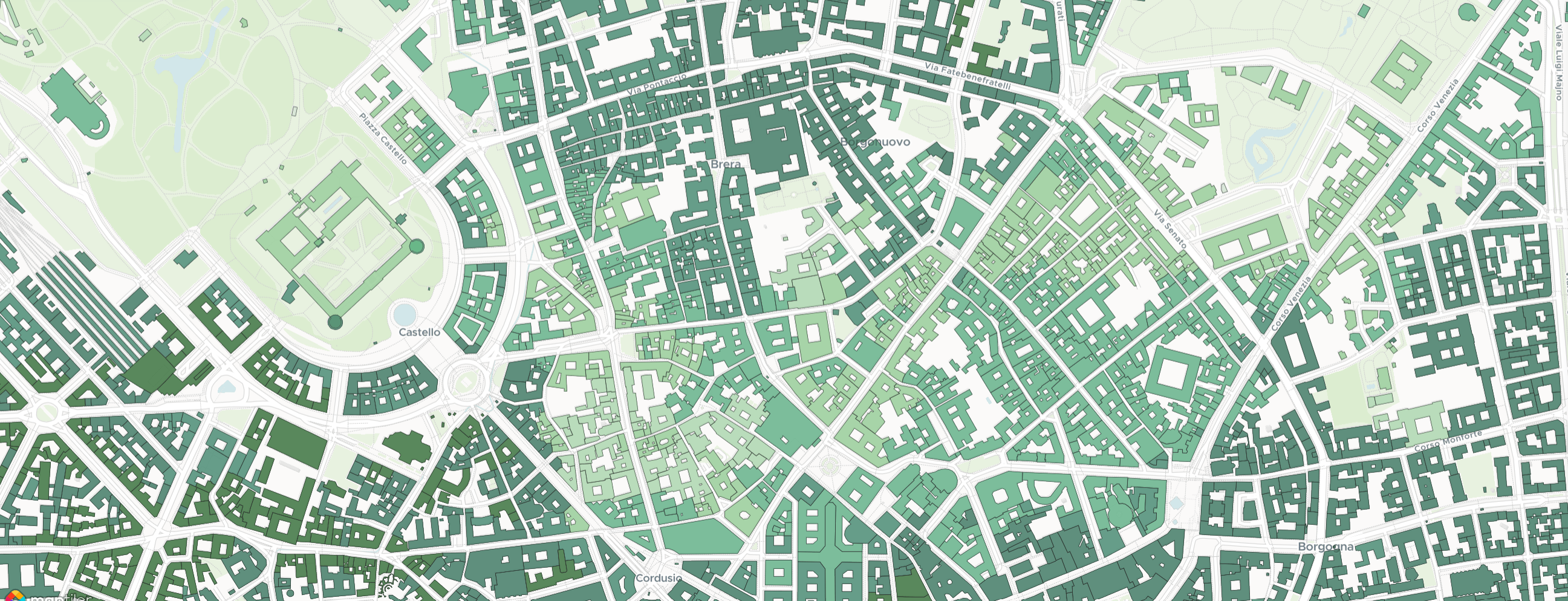
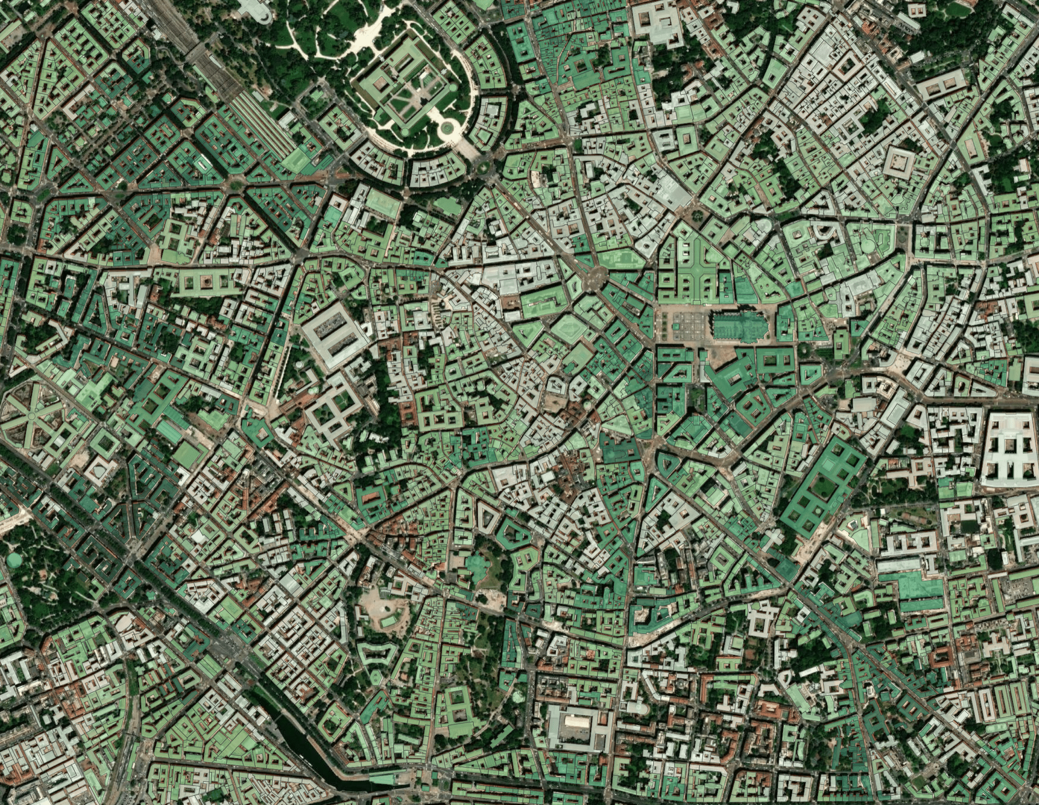
Types of Urban Planning Maps
Urban planners use different types of maps depending on the problem they're solving. Some common types include land-use maps, transportation maps, accessibility maps, environmental maps, and demographic maps. Each of these plays a role in understanding how cities function and how they can be improved.
Today, many cities and planners are combining these layers into interactive maps that help them simulate changes and test policies before implementation.
Challenges with Traditional Mapping
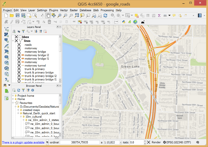
While GIS software like ArcGIS or QGIS is powerful, it's often too technical or time-consuming for many planning departments. Planners face issues such as outdated or incomplete datasets, difficult integrations between transit, building, and population data, long turnaround times for analysis, and limited ways to share results with non-technical audiences.
This is where modern, web-based tools can make a real difference.
The Rise of Data-Driven Urban Planning Maps
Recent advances in open data, such as OpenStreetMap and GTFS transit feeds, and improvements in cloud computing have made it easier than ever to build dynamic urban planning maps. Instead of manually layering data, planners can now generate isochrones automatically, visualize walkability, bikeability, and transit access in real time, upload their own city datasets, and export professional-grade visuals for reports and presentations.
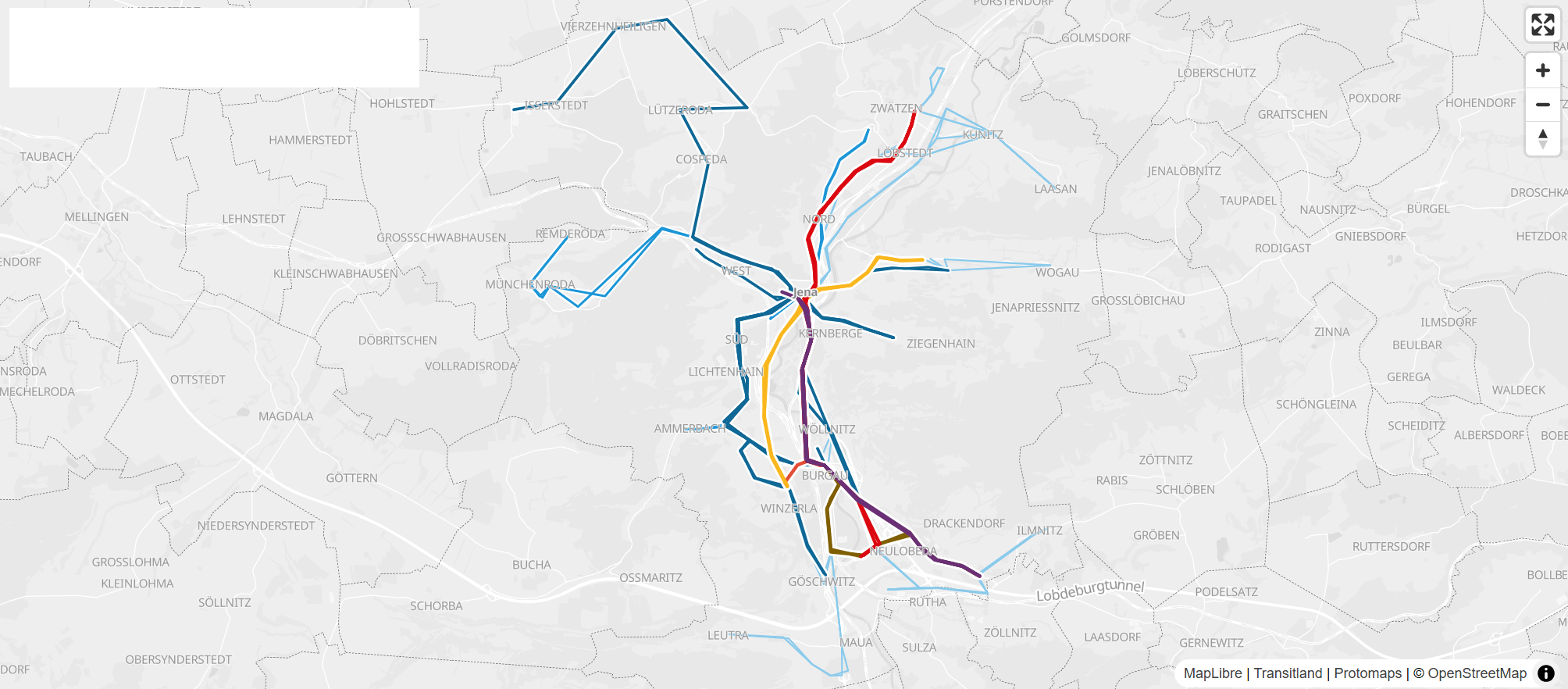
These tools are helping planners make faster, evidence-based decisions and communicate those insights more effectively to stakeholders.
Example: Accessibility-Focused Urban Planning Maps
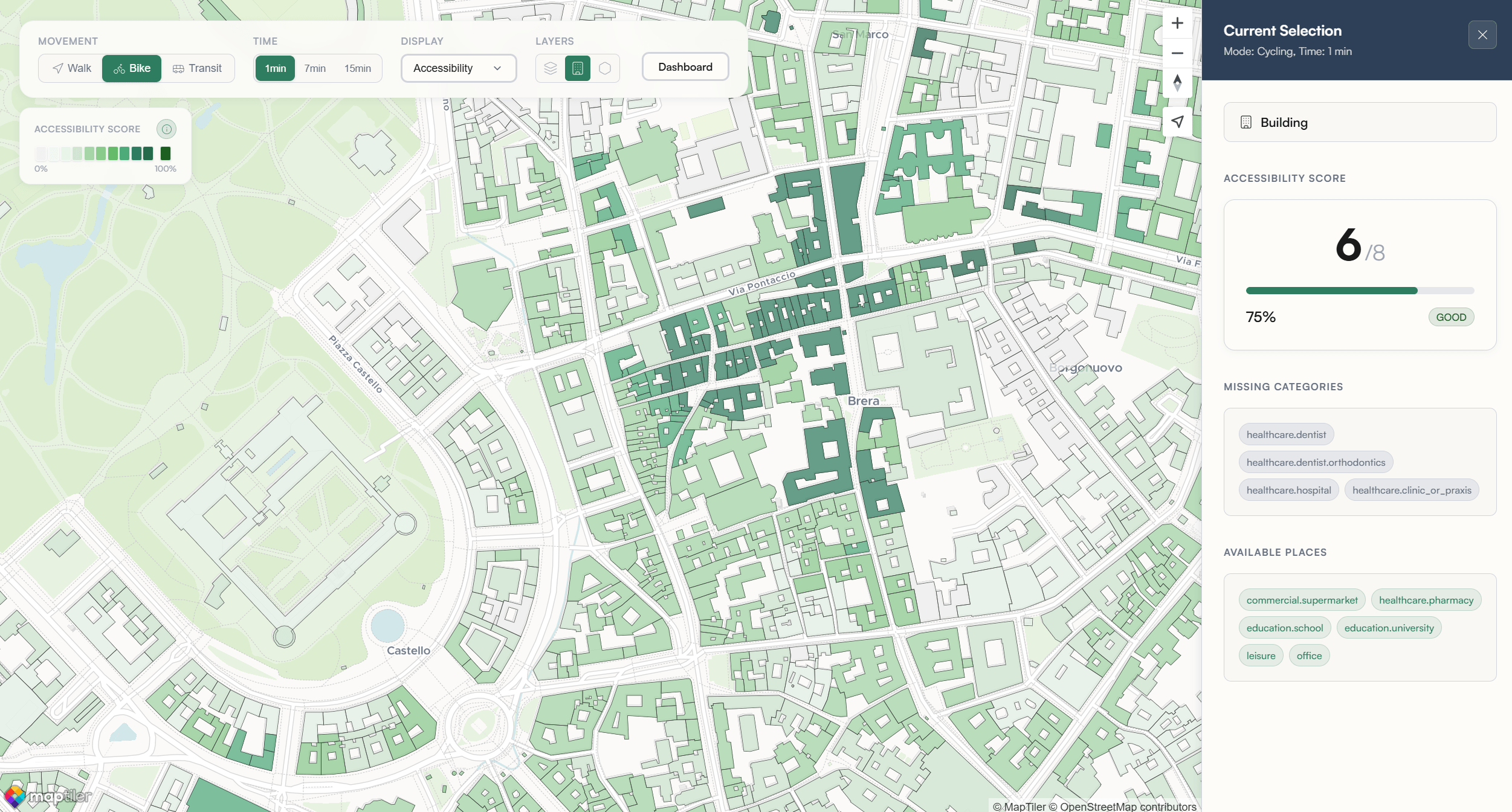
One of the most powerful ways to use urban planning maps today is to measure accessibility, the ease with which residents can reach daily needs like groceries, schools, or parks. By mapping accessibility, planners can understand which areas are underserved, compare neighborhoods objectively, and test how new infrastructure affects accessibility scores.
Platforms like Maporra are designed specifically for this. They combine open data sources and routing algorithms to generate city-wide accessibility maps in minutes, showing where a city succeeds and where it falls short.
How to Create Your Own Urban Planning Map
If you want to start visualizing your own city's accessibility, begin by gathering your data. Start with OpenStreetMap for roads and buildings and GTFS feeds for public transit. Choose your tools, such as Maporra, to process and visualize data quickly without any GIS setup. Select your metrics, whether you’re mapping walkability, transit access, or 15-minute city readiness. Analyze the results to identify areas with poor access and explore possible improvements. Finally, share your insights with colleagues, policymakers, or the public to drive action.
The Future of Urban Planning Maps
Urban planning maps are evolving from static PDFs to interactive, data-rich dashboards. The next generation of planners will rely on real-time data, AI-driven scenario testing, and open, collaborative platforms that connect planning, mobility, and sustainability goals. The goal isn’t just to make prettier maps—it’s to make better decisions, faster.
Final Thoughts
Urban planning maps are the backbone of better cities. They transform raw data into understanding, and understanding into action. As cities strive to become more walkable, sustainable, and equitable, planners need tools that keep up with their ambition. That’s exactly what platforms like Maporra aim to do: help planners measure, visualize, and improve accessibility in hours, not weeks.